Building Themes with Winden Tokens: Light Mode, Dark Mode & Beyond
Overview
Learn how to create and manage themes using Winden Tokens. This tutorial covers multi-mode variables, theme switching, and building flexible design systems that support light mode, dark mode, and custom themes.
What You’ll Learn
In this tutorial, you’ll discover:
- Theme Creation: Building theme systems with Winden Tokens
- Multi-Mode Variables: Working with Figma’s variable modes for theming
- Theme Management: Organizing and maintaining multiple themes
- Token Architecture: Structuring tokens for theme flexibility
- Best Practices: Professional approaches to theme implementation
Key Theming Topics
This video explores essential theming concepts:
- Setting up theme collections and modes
- Creating semantic token layers
- Implementing light and dark themes
- Building custom brand themes
- Managing theme-specific token values
- Testing and validating themes across components
Why Theming Matters
Theming is crucial for modern design systems:
- User Preferences: Support light/dark mode preferences
- Brand Flexibility: Easy brand customization and white-labeling
- Accessibility: Create high-contrast and accessible themes
- Consistency: Maintain design consistency across themes
- Efficiency: Change themes globally without redesigning
Theme Architecture Best Practices
Structure your tokens for maximum flexibility:
- Primitive Tokens: Base values (colors, sizes)
- Semantic Tokens: Purpose-based tokens (background, text, border)
- Component Tokens: Component-specific overrides
- Theme Modes: Light, dark, and custom themes
Getting Started with Theming
Prerequisites for this tutorial:
- Winden Tokens installed in Figma
- Understanding of basic variable concepts
- Familiarity with design token patterns
If you need to install Winden Tokens:
- Go to Plugins > Development > Import plugin from manifest in Figma
- Select the
manifest.jsonfile from the GitHub repository - Or build from source using
npm run build
Common Theming Patterns
Light/Dark Theme Pattern
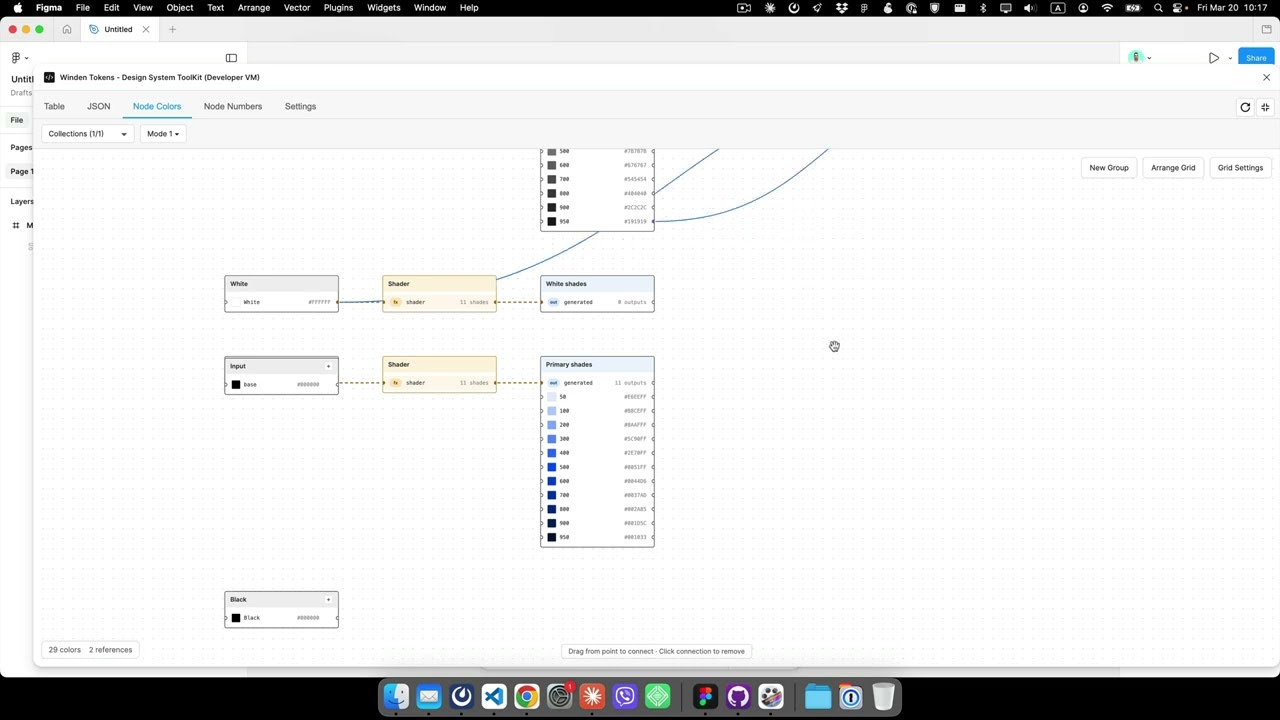
Primitive Collection:
- gray-50, gray-100, ... gray-900
- brand-primary, brand-secondary

Semantic Collection (Light/Dark modes):
- background: gray-50 (light) / gray-900 (dark)
- text: gray-900 (light) / gray-50 (dark)
- primary: brand-primary (both)
Multi-Brand Pattern
Brand Collection (Brand A/Brand B modes):
- primary: blue-600 (A) / red-600 (B)
- secondary: blue-400 (A) / red-400 (B)
Implementation Steps
Follow this workflow for theme implementation:
- Plan Your Theme Strategy: Define required themes and token structure
- Create Primitive Tokens: Establish base color and size values
- Build Semantic Layer: Create purpose-based tokens with modes
- Apply to Components: Use semantic tokens in your components
- Test Themes: Validate all themes across your design system
- Document: Create theme documentation for your team
Related Resources
- Design Tokens Best Practices
- Advanced Features Tutorial
- Winden Tokens Introduction
- Complete Documentation
- Latest Release Notes
Theming Tips & Tricks
- Use Aliases: Reference primitive tokens in semantic tokens
- Test Early: Check themes as you build components
- Name Consistently: Use clear, purpose-based names
- Document Modes: Clearly label each theme mode
- Version Control: Track theme changes carefully
Real-World Applications
Theming is valuable for:
- Multi-brand product families
- White-label applications
- Accessibility compliance (high-contrast themes)
- User preference support (light/dark mode)
- Seasonal or event-based themes
Continue Learning
Explore more theming topics:
Have Questions?
If you have questions about theming:
- Open an issue on GitHub
- Watch more tutorials in our tutorial series
- Check out our comprehensive documentation
Master theming and create flexible, scalable design systems with Winden Tokens!