5 Best Practices for Organizing Design Tokens at Scale
Design tokens are the foundation of any scalable design system. After working with hundreds of users, we’ve identified the patterns that separate good token systems from great ones.
1. Use Semantic Naming, Not Descriptive
Don’t do this:
blue-500
red-600
gray-100
Do this instead:
color-primary
color-error
color-surface
Why? Because blue-500 might not always be blue. Semantic names describe purpose, not appearance, making your system flexible and future-proof.
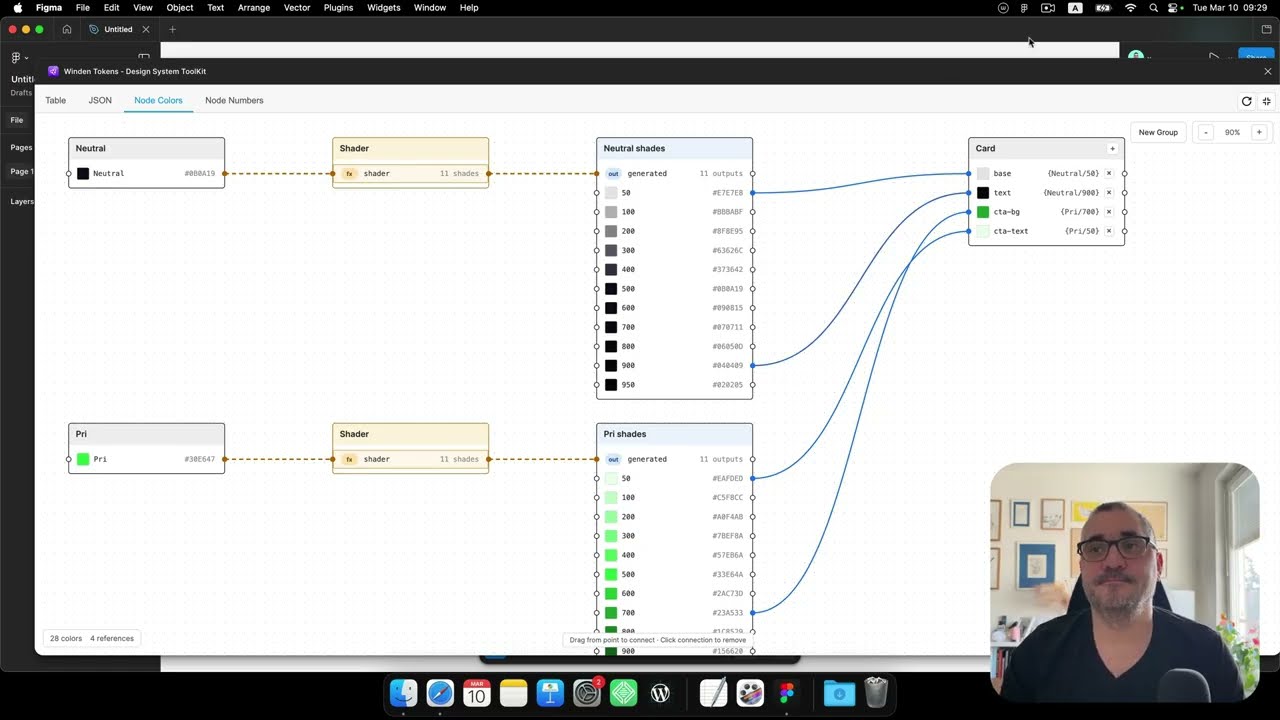
2. Create Reference Tokens
Build two layers: primitive tokens (raw values) and semantic tokens (contextual references).
Primitive layer:
- blue-600: #2563eb
- red-500: #ef4444

Semantic layer:
- color-primary: {blue-600}
- color-error: {red-500}
This lets you rebrand your entire system by updating just the primitive layer!
3. Use Consistent Number Scales
Stick to predictable scales for consistency:
- Spacing: 4px base scale (4, 8, 12, 16, 24, 32, 48, 64…)
- Typography: Modular scale (12, 14, 16, 20, 24, 32, 48…)
- Colors: 50-900 scale for shades
Winden Tokens has built-in generators for these scales—use them!
4. Document Mode Usage
Using light/dark modes? Document when to use each:
Mode: Light
- Use for: Default theme, web app, marketing site

Mode: Dark
- Use for: User preference, OLED optimization, night mode
Clear documentation prevents mode confusion and inconsistent usage.
5. Leverage Collections for Organization
Group related tokens into collections:
- Colors - All color primitives and semantics
- Spacing - Margin, padding, gap values
- Typography - Font sizes, weights, line heights
- Elevation - Shadow and layer tokens
Collections make your system navigable and maintainable.
Bonus: Start Small, Scale Gradually
Don’t build everything at once. Start with:
- Core colors (primary, error, success)
- Base spacing scale
- Typography fundamentals
Then expand as needs emerge. A focused system is better than a bloated one.
What patterns work for your team? Share your experiences in our GitHub Discussions!